Mobile Friendly Website Design: The Local Business Guide to Winning Customers
Learn essential tips for mobile friendly website design to enhance user experience and grow your Australian business efficiently.
Picture this: a potential customer tries to walk into your shop, but the door is jammed. They can't get in, so they shrug and walk over to your competitor next door. That’s exactly what happens every day when a local business has a website that isn't built for a phone.
For a small business, a mobile-friendly website design isn't just a tech trend; it's the front door to your online presence. If that door is locked, you're losing business. It's that simple.
Why Mobile Design Is Your Most Important Storefront
For a local business, your website is often the very first handshake with a new customer. It's your digital business card, your shop window, and your 24/7 salesperson all rolled into one.
If that first impression is clunky, slow, or frustrating on a smartphone, you’re not just losing a visitor. You're losing a sale.
But it goes deeper than just customer convenience. It’s about being found in the first place. Google now uses mobile-first indexing. This means Google primarily looks at the mobile version of your site to decide how to rank it. A poor mobile site doesn't just annoy users—it makes you practically invisible when local customers search for your services.
From Clicks to Customers: How Mobile Design Affects Your Bottom Line
A well-executed mobile-friendly website design isn't just about looking good on a small screen. It's about creating a smooth, direct path for local customers to find you, trust you, and ultimately, pay you for your services.
The difference between a site built for mobile and one that isn't is night and day. Just look at the data on traffic, how long people stick around, and how many actually become paying customers.
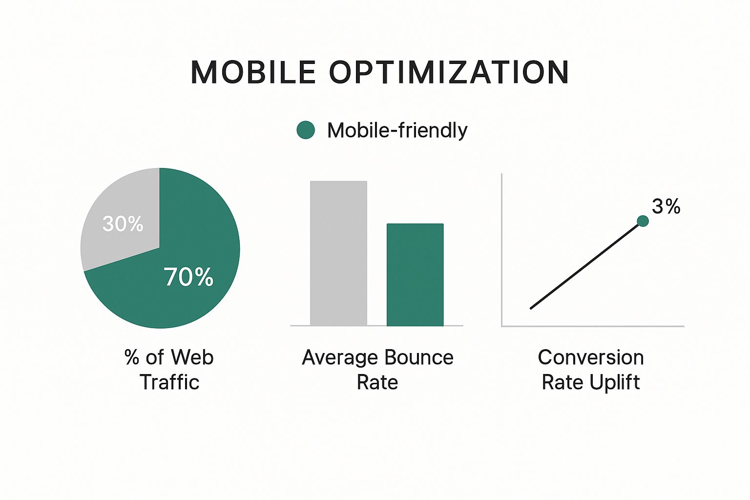
The numbers don't lie. A mobile-friendly site isn't just a technical box to tick; it’s a powerful tool that directly fuels business growth.
For any local business, every lead is precious. A bad mobile experience is like having a faulty phone line—people who are actively trying to give you money will just hang up and call the next person on the list.
Here are actionable benefits that tie directly to your growth:
- Show Up in Local Searches: When someone is out and about searching for "plumber near me" or "cafe in Carlton," they're on their phone. A site optimised for mobile is far more likely to appear in these critical, high-intent searches.
- Build Instant Trust: A website that just works on a phone—with easy-to-read text and clickable buttons—builds immediate confidence. It tells customers: if you care about your website, you’ll care about your work.
- Get More Enquiries and Sales: By making it incredibly simple for someone to tap a button to call you, fill out a quick form, or get directions, you remove all the friction. This drastically increases the chances they'll take the next step. While it's an investment, you can learn more about how much a website will cost to get a clearer picture of the potential return.
How Your Australian Customers Actually Use the Web

Before we dive into the nuts and bolts of mobile-friendly design, let's get one thing straight: you need to see the internet through your local customers' eyes. This is about understanding the real-life moments that lead someone to search for your services on their phone.
Picture this: it’s a rainy Tuesday night in Melbourne and a homeowner hears a pipe burst. They’re not booting up a desktop computer; they're standing in a growing puddle, phone in hand, frantically typing "emergency plumber near me". They need a solution, and they need it now.
This is where your business either wins or loses. If your website takes ages to load or is a jumble of tiny text they can't read, they're gone. They’ll hit the back button and tap on the next plumber in the search results—the one with a big, clear phone number right at the top. You just lost a job in under five seconds.
The Mobile-First Mindset of Your Customers
This isn't a rare occurrence; it's how business is done in Australia today. The numbers show that a massive 94.9% of Australians use their mobile phones to get online. They're spending almost three hours a day on those devices.
What this really means for your small business is that a fast, easy-to-use mobile site isn't just a "nice-to-have". It's the absolute minimum expectation. If you're curious about how this is playing out across the board, you can read more about how these trends are shaping Australian web design.
Think of your mobile site as a helpful employee who gets straight to the point. Your customer has a problem, and your website needs to offer the solution instantly. Any friction or delay sends them straight to your competition.
Common Scenarios Where Mobile Wins or Loses Business
Let's look at a few other everyday situations where a great mobile site can land you a job, and a poor one can cost you dearly.
- The Quote Seeker: A couple is on the sofa planning a garden makeover. They're scrolling through local landscapers on their tablet. Websites with beautiful, fast-loading photo galleries and simple contact forms make their shortlist. The ones with pixelated images that take forever to appear? They get closed and forgotten.
- The On-the-Go Tradie: A builder on a busy construction site realises they're short on a specific part. They pull out their phone to find a local supplier. They need to see an address and opening hours immediately. If they have to pinch and zoom to find your details, they'll just call the supplier whose information is front and centre.
- The Word-of-Mouth Checker: Your carpentry business gets a glowing recommendation from a happy client. The first thing their friend does is pull out their phone and search for your business name. A professional, polished website that's easy to browse builds immediate trust. A clunky, outdated site does the exact opposite.
The Core Principles of Great Mobile Design
Diving into mobile-friendly web design can feel overwhelming, but you don't need to be a coder to get it right. For your small business, you just need to grasp a few core, actionable ideas.
Think of these principles as common-sense foundations for turning mobile visitors into paying customers. Understanding them will help you make smarter decisions, whether you're working with a pro or tackling your site yourself.
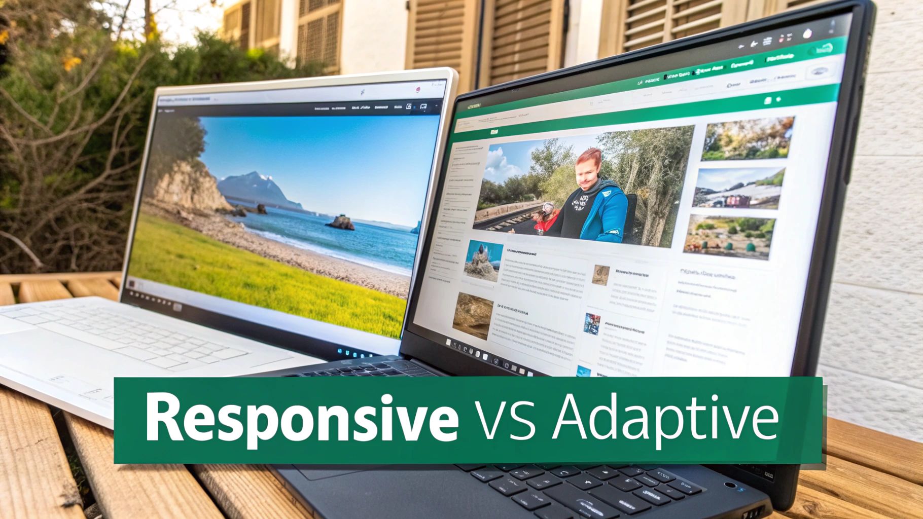
Responsive Design: The Liquid That Fills Any Container
If there's one principle that stands above all others, it's responsive design. Imagine pouring water into different-sized cups. The water just adapts. A responsive website does the same with your content.
It automatically restructures your layout, text, and images to fit the screen it’s on—from a small smartphone to a tablet or a large desktop monitor. This creates a great experience for every visitor.
Actionable Tip: A responsive site means you only have one website to manage, saving you time and money. Plus, Google actively prioritises responsive sites, which helps more local customers find you in search results.
Make Navigation Touch-Friendly
On a desktop, we use a precise mouse cursor. On a mobile, customers use their thumbs. This is a crucial difference that many small business websites get wrong.
Touch-friendly navigation simply means making your buttons and links big enough to be tapped easily, without accidentally hitting something else.
- What it is: Designing buttons, menu items, and links that are large and have space around them. A good rule of thumb is a target size of at least 44 pixels square.
- Why it matters: If a customer struggles to tap your "Request a Quote" button, they’ll give up. Easy-to-tap buttons remove that frustration and make it simple for people to take action.
Ensure Your Text Is Always Readable
You land on a website on your phone and have to pinch-and-zoom just to read the words. It’s an instant turn-off. Your customers shouldn't have to work to read about your services.
Readable text on mobile is simple: the font size is large enough by default, and there's strong contrast between the text and the background (like dark text on a light background). Nailing this simple detail is a key part of how a simple website upgrade can double your leads.
Keep Your Forms Simple and Short
Filling out long forms is a pain on a desktop. On a mobile keyboard, it’s even worse. If your contact form asks for too much information, you will lose enquiries.
A mobile-friendly form asks for the bare essentials to start a conversation:
- Name: Just one field is enough.
- Phone Number: So you can call them back.
- Brief Message: A small box for their question.
That’s it. Get the rest of the details when you speak to them. The goal is to make it as easy as possible for a customer to reach out.
How to Convert Mobile Visitors Into Customers

Getting potential customers to your website is half the battle. The real goal is turning those visitors into paying customers. This is where a great mobile friendly website design proves its worth—it's not just about looking good, it's about making it incredibly easy for people to take the next step.
It’s no secret that mobile conversion rates often lag behind desktop. The culprit is almost always a frustrating user experience. Someone on their phone wants two things: speed and simplicity. Any delay is an invitation for them to leave.
This is especially true for Australian customers. The data shows that 53% of mobile users in Australia will abandon a website if it takes longer than three seconds to load. The performance gap is stark—while desktop users convert at an average of 3.2%, their mobile counterparts in Australia convert at just 1.8%. This highlights a massive opportunity for local businesses that get mobile right. You can dive deeper into these Australian marketing statistics and their impact.
Speed Is Your Unfair Advantage
If there’s one thing that will keep a mobile visitor on your site, it’s speed. If a potential customer has to wait, they won’t. They’ll just hit the back button.
Here are two practical steps you can take to speed things up:
- Compress Your Images: Large photos are the biggest cause of a slow site. Use a free online tool like TinyPNG to compress your images before you upload them. This shrinks the file size without a noticeable loss in quality.
- Keep Your Design Simple: Flashy animations can grind a mobile site to a halt. A clean, straightforward layout loads faster and makes it easier for customers to find what they’re looking for.
Make It Easy to Take Action
Once your site is fast, your next job is to make it ridiculously simple for visitors to get in touch. Don’t make people hunt for your phone number.
Your mobile website's job is to close the distance between a customer's problem and your solution. Every click you remove and every second you save for them brings you closer to a sale.
Here’s an actionable checklist to turn your site into a lead-generating machine:
- Use Click-to-Call Phone Numbers: This is non-negotiable. Make your phone number a clickable link. It allows a user to simply tap the number and call you directly.
- Create Obvious Call-to-Action (CTA) Buttons: Your "Request a Quote," "Book Now," or "Call Us" buttons need to stand out. Make them bright, bold, and place them at the top of the page and after you describe a key service.
- Simplify Your Contact Forms: Strip your form back to the absolute essentials: name, phone number, and a short message field. Make it easy for them to start the conversation.
Your Action Plan for a Mobile-Friendly Website
Right, let's get practical. A great mobile-friendly website design is built through testing and smart improvements. Think of this as your step-by-step checklist to see where your site stands and how to improve it.
Start With a Quick Diagnosis
First, let's get an objective view of your website's performance. You might think your site looks okay on your phone, but Google’s tools see things differently—and their opinion is what counts for your search ranking.
Use Google's free Mobile-Friendly Test. Just enter your website's address, and you’ll get a simple "pass" or "fail". It even points out specific issues, like text being too small or buttons too close together. This report is your starting point.
Conduct a Real-World Test
While Google’s test gives you a technical score, nothing beats a real-world check. Grab your smartphone and try to complete these basic tasks on your own website. Better yet, ask a friend who doesn't know your site to try.
- Find Your Phone Number: How many taps does it take? Is the number clickable?
- Request a Quote: Can you find and fill out the contact form easily?
- Locate Your Service Area: Is it clear which suburbs or regions you serve?
If they get stuck, you’ve found a roadblock that’s costing you customers. This feedback is pure gold.
Create a Clear Brief for Your Developer
If your testing reveals problems, you'll need to get a web developer involved. To save time and money, be specific. Don't just email them, "make my site mobile-friendly."
A helpful brief sounds like this: "Customers are struggling to tap the phone number on mobile. Can we make it a big, click-to-call button in the header? Also, the contact form is too long; let's cut it down to just name, phone, and a message."
This kind of actionable feedback helps a developer fix the real issues much faster.
For the DIY Business Owner
Managing your own website on a platform like WordPress, Shopify, or Squarespace? Your best move is to choose a theme that is explicitly labelled as "responsive".
A responsive theme automatically reshuffles your content to look good on any screen. When customising it, keep things simple. Avoid too many pop-ups or fancy animations that can slow down your site on a mobile connection.
Nailing these fundamentals is a huge step towards improving your visibility. For more, our guide on how to rank higher on Google Search covers other strategies that pair perfectly with a top-notch mobile site.
Right then, even after laying out a game plan, it's completely normal for small business owners in Australia to still have a few nagging questions about mobile-friendly websites. Getting clear, no-nonsense answers is the key to moving forward with confidence. So, let's tackle some of the most common queries we hear from business owners just like you.
Think of this as your final Q&A session to iron out any last doubts. We’ll keep the answers practical and straight to the point, helping you invest your time and money where it will make a real difference.
My Website Looks Okay on My Phone, Is That Good Enough?
This is a common question. You pull up your site on your phone, and it seems to work. But a truly mobile-friendly website design is about more than just shrinking your desktop site. It’s about creating an experience designed to get results.
A properly optimised site focuses on what a mobile user needs:
- Load Speed: It must load in under three seconds.
- Touch Targets: Buttons and links must be easy to tap with a thumb.
- Simple Navigation: Your menu should be easy to use, with key information just a tap or two away.
- Easy Forms: Your contact form must be short and simple to complete.
"Okay" might stop someone from leaving immediately, but "optimised" is what convinces them to trust you and make an enquiry. Don't just trust your own eyes—run your site through Google's Mobile-Friendly Test for an unbiased look.
What Is the Difference Between a Mobile Friendly Site and a Mobile App?
This is a great question. A mobile-friendly website is your main website, accessed through a browser like Chrome or Safari. It’s built to adapt to any device.
A mobile app is a separate program a user has to download from an app store and install on their phone.
For almost every local business, a mobile-friendly website is the essential first step. It’s crucial for being found on Google. An app is a more specialised tool, usually better for businesses with a large, loyal customer base that makes repeat purchases.
How Much Does It Cost to Make a Website Mobile Friendly?
The cost depends on your current website's age and technology.
If your site is built on a modern platform like WordPress, Squarespace, or Shopify, the fix might be simple. Often, it's a matter of switching to a new "responsive" theme, which could be a relatively low-cost project for a developer.
However, if your website is old and was custom-built years ago, it will likely need a complete rebuild. While this is a more significant project, it's better to see it as a crucial investment. The cost of a bad mobile experience—measured in lost leads and being invisible on Google—is always much higher.
At SiteStarter, we take all the guesswork and technical headaches out of getting a professional website that actually performs. We build sites for tradies and small businesses that are designed from day one to attract customers, rank on Google, and turn visitors into genuine leads. Let us handle the digital stuff so you can get back to doing what you do best.
Get a powerful, customer-winning website today with SiteStarter