Discover How a Simple Website Upgrade Can Double Your Leads
Learn how a simple website upgrade can double your leads. Boost your business today with easy, effective web improvements. Get started now!
A simple website upgrade could literally double your leads. I’m not talking about a massive, expensive redesign from the ground up. The real wins for a small business come from fixing the small, often-overlooked issues that make potential local customers click away. It's about making smart, strategic tweaks to your site's speed, layout, and messaging to turn it from an online brochure into your best lead-generating tool.
Your Website Is a Leaky Bucket—Here’s How to Fix It
For any local business, your website should be your hardest-working employee. It’s on the clock 24/7, ready to greet potential customers. But what if it’s quietly failing you? Many business owners don't realise their website is like a bucket riddled with tiny holes, dripping away potential jobs every single day.
You don't need to throw the whole bucket out and buy a new one. The secret is simply patching those leaks with small, strategic fixes that don't cost a fortune.
Think of it like this: if you’re a plumber, every patch you add to a leaking pipe saves water. In the same way, every small tweak you make to your website captures another lead that would have otherwise been lost forever to a competitor.
This is all about working smarter, not harder. By focusing on a few crucial areas, you can transform your website into a powerful asset that consistently brings in new business. This visual breaks down exactly how you can start analysing your site's performance to find those golden opportunities.
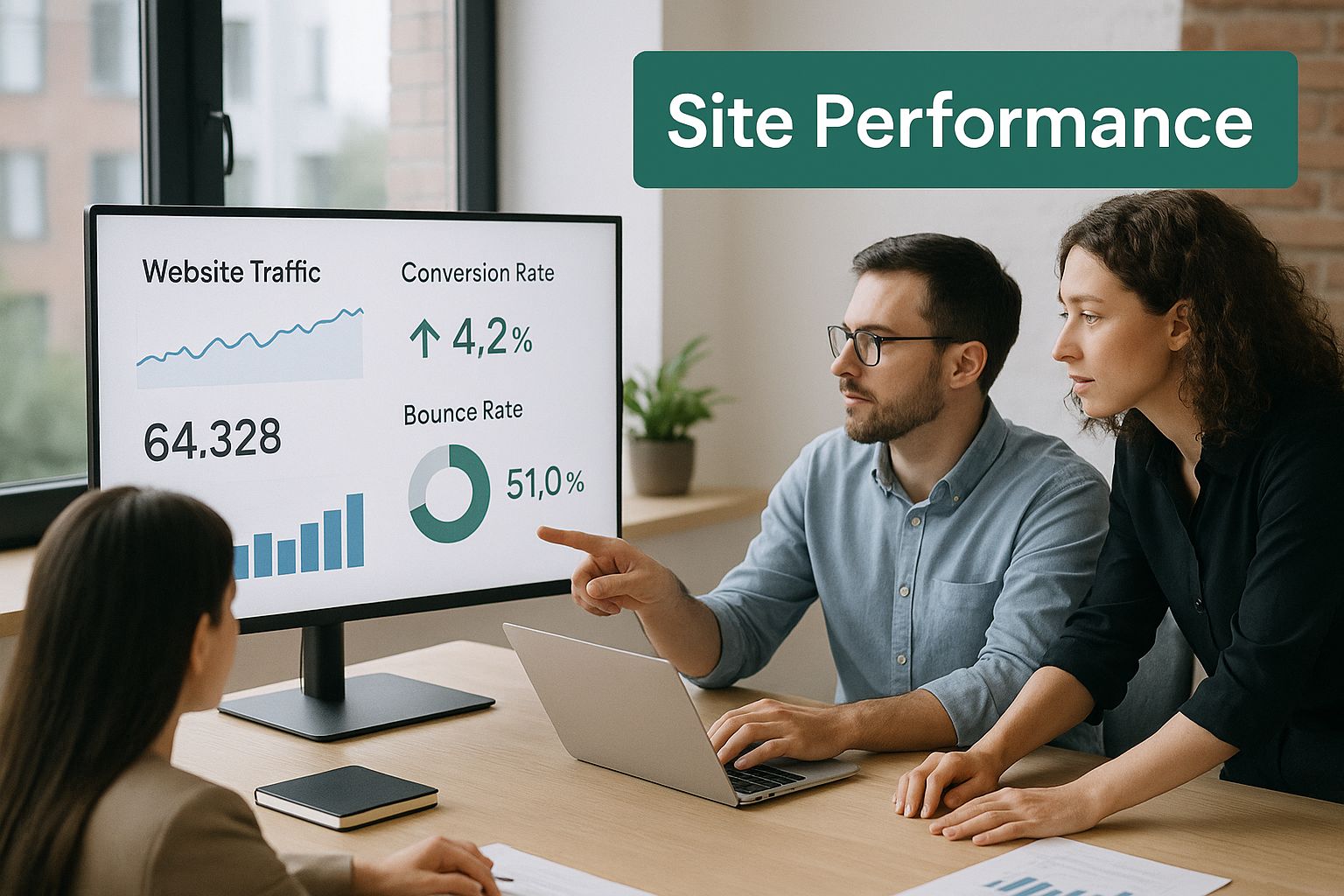
As the image shows, the first step is always to look at what's actually happening on your site. The data tells you exactly which parts of your website need attention to start pulling in more leads from your local area.
Turning Visitors Into Paying Customers
The whole game is about improving your site's conversion rate. In simple terms, that's the percentage of visitors who actually do what you want them to do—like picking up the phone to book a job or filling out your contact form. This is how a simple website upgrade can double your leads without you needing to spend a single extra dollar on ads or marketing.
Let’s look at the numbers. In Australia, the average e-commerce conversion rate hovers around 1.78%. That’s not great. Industry benchmarks suggest a healthy site should be aiming for 2.5% to 3%. Now, imagine taking your site from a 1.78% conversion rate to 3.56%. You’ve just doubled your sales from the exact same number of visitors.
For local service businesses, like builders, electricians, or plumbers, the potential is often even higher, making these small upgrades incredibly valuable for winning more local work.
To give you a clearer picture, here’s a quick summary of the core website upgrades and the problems they solve for a small business.
Key Upgrades and Their Impact on Leads
| Website Upgrade | Problem It Solves | Impact on Leads |
|---|---|---|
| User Experience (UX) | Visitors are confused and can't find your phone number or services. | A clear, intuitive layout keeps local customers on the site longer and guides them toward contacting you, directly boosting quote requests. |
| Website Speed | Your site loads too slowly, causing impatient visitors to leave and call your competitor. | A fast-loading site reduces bounce rates and ensures potential customers see your offer before they give up, capturing leads you'd otherwise lose. |
| Calls-to-Action (CTAs) | Visitors look at your site but don't know what to do next. | Strong, clear CTAs like "Call for a Free Quote" eliminate hesitation and provide a direct path for users to become leads, dramatically increasing form submissions and calls. |
These are the foundational fixes that will have the biggest and fastest impact on your lead generation.
The Three Areas to Focus on First
Ready to get started? Concentrate your energy on these three fundamental elements:
- User Experience (UX): Is your website a maze? Can a first-time visitor find your phone number or list of services in under five seconds? A confusing layout is the number one reason people leave a site.
- Website Speed: In today's world, patience is thin. If your site takes more than three seconds to load, you're losing people. A fast website shows you respect your visitor's time.
- Clear Calls-to-Action (CTAs): Are you clearly telling people what you want them to do? A bold "Get a Free Quote Today" button will always outperform a vague "Contact Us" link hidden in the footer.
By tackling these core issues, you're plugging the biggest leaks in your digital bucket. And for tradespeople who really want to get ahead, our guide on SEO for tradesmen digs even deeper into how you can get found by more local customers online.
Your Website's First Impression: It All Comes Down to User Experience
Picture your website as your physical storefront or your work ute. If a potential customer walks in and the place is a mess—or if your ute is dirty and disorganised—what do they think? They assume your work is messy too, and they leave. Your website works exactly the same way.
That crucial first impression is what we call user experience, or UX. It’s not a complex tech term. It simply means making your website easy and pleasant for local people to use. A great user experience acts like a friendly guide, leading visitors smoothly from the moment they land on your site to the point where they're ready to pick up the phone and book a job.
For a local business, this is where a few simple website improvements can literally double your leads. By improving how your site is organised, you build instant trust and make it an absolute no-brainer for people to take that next step.
Don't Make Them Think: Simplify Your Website Navigation
Think of your website's main menu as the aisle signs in a hardware store. They need to be big, clear, and logical, helping people find what they're looking for without a second thought. If a visitor is searching for "Gutter Cleaning" but has to click through five different pages to find it, they've almost certainly left and called your competitor.
Here are a few practical tweaks you can make right now to get your layout and navigation sorted:
- Group Your Services Logically: Think like your customer. A local electrician, for instance, should have clear menu items like "Switchboard Upgrades," "LED Lighting," and "Emergency Call-Outs."
- Put Your Contact Info Front and Centre: Your phone number should be impossible to miss, ideally in the top corner of every single page. Never make a potential customer hunt for it.
- Show, Don't Just Tell, with Quality Photos: Use clear photos of your actual work in your local area. Seeing is believing, and images of your finished jobs build instant credibility and prove the quality you deliver.
These aren't huge, expensive changes. They're small adjustments that transform a confusing website into a helpful tool, guiding local customers directly to the information they need to make a decision.
A study from Forrester Research found that a well-thought-out user interface can boost a website's conversion rate by up to 200%. That’s not a typo. It just goes to show how powerful a clean, simple layout is for drumming up more local business.
At the end of the day, brilliant UX isn't about flashy design; it's about clarity and respecting your visitor's time. A homeowner with a burst pipe doesn't need an award-winning website. They need a site that clearly says, "I'm a local plumber, I can fix your problem now," shows proof of great work, and makes it incredibly easy to call you. Nail these fundamentals, and you'll create a seamless path for visitors to become your next paying customers.
Don’t Lose Customers to a Slow Website

Let's be honest, we live in an impatient world. When a potential customer clicks on your website, the clock starts ticking. If they're left staring at a loading screen for more than a couple of seconds, they're gone—often straight to your competitor's site. A slow website isn't just a minor annoyance; it's a lead-killer.
Think of your site's speed as the first handshake you have with a potential customer. A fast, snappy site says you're professional and you value their time. A sluggish one? It suggests a lack of care, eroding trust before they've even had a chance to see your services.
This isn't just about making a good first impression, either. Google is watching. The search engine actively rewards faster websites with better rankings in local search results, while slower sites get pushed down, making it that much harder for new customers to find you.
It's not just a hunch. Google’s own data shows that when a page’s load time creeps from one to three seconds, the chance of a visitor leaving immediately jumps by 32%. If it takes five seconds? That probability soars to a staggering 90%. Every single second counts.
Practical Fixes for a Faster Site
You don't need to be a coding genius to speed things up. It usually comes down to a few common culprits that small business owners can easily fix. Here are the three main things that grind most websites to a halt and how you can fix them.
- Bloated Images: This is the big one. Photos straight off a modern phone can be huge. Uploading them without resizing them first is like trying to load heavy tools into a small car—it slows everything down.
- Poor Hosting: Think of your web host as the foundation of your workshop. If you build on cheap, shared ground, everything will be slower and less reliable.
- Too Many Plugins: For platforms like WordPress, plugins are fantastic for adding features. But each one adds a little more weight. Too many—especially old or unnecessary ones—can bring your website to a crawl.
By sorting out these common issues, you're fixing the biggest speed bumps that are costing you business right now.
Your Simple Speed-Boost Action Plan
Ready for a faster site? Here are three straightforward steps you can take today to give your site a much-needed tune-up and start winning over those impatient visitors.
- Compress Your Images: Before you upload any image, run it through a free tool like TinyPNG or Squoosh. These can slash the file size without any noticeable drop in quality. A good rule of thumb is to aim for under 200 KB per image.
- Choose a Reliable Australian Host: If your customers are in Australia, your website should be hosted here too. Using a local provider means the data doesn't have to travel as far, which translates to a much faster experience for your local visitors.
- Conduct a Plugin Audit: Log in to your website dashboard and go through your list of plugins. If you don't know what something does or you're not actively using it, deactivate and delete it. Be ruthless. Only keep what is absolutely essential for your business.
Making your website's performance a priority is one of the quickest ways to get more leads. Don't let a few seconds of loading time stand between you and your next local customer.
Crafting Calls to Action That Actually Get Clicks
Your website can be well-organised and super fast, but if you don't clearly tell visitors what to do next, you're throwing away business. This is where the Call to Action (CTA) comes in. For a local business, a powerful CTA is often the only thing separating a casual browser from your next job.
Think of it like finishing a quote. You’ve shown them the problem and explained your solution; now you need to ask for the job. A weak button like ‘Submit’ or a tiny ‘Contact Us’ link is like mumbling at the end of a confident pitch. It just doesn't inspire action.
To get real results, your CTAs need to be direct, compelling, and make it ridiculously easy for people to say yes. This simple website upgrade alone has the power to double your leads by turning passive interest into a decisive click.
From Vague to Valuable
The first rule is to stop being generic. Your CTA should be a direct solution to your customer’s problem. Instead of a bland button, use action-packed language that tells them exactly what they get.
Here are a few simple swaps that can make a world of difference for a local business:
Instead of: Contact Us
Try: Get Your Free, No-Obligation Quote
Instead of: Learn More
Try: See Our Fencing Projects
Instead of: Submit Form
Try: Book a Free Onsite Inspection
See the difference? This small shift in wording changes the entire feel. It moves the focus from a boring command to the valuable outcome the customer receives.
A CTA isn't just a button; it's the trigger that turns a potential customer into an actual lead. Studies show that personalising CTAs can boost conversion rates by over 200%. This means making the button text directly relevant to the service on that specific page. For example, on your "Roof Repair" page, the button should say "Get My Roof Inspected."
Make Your CTAs Impossible to Ignore
Once you've nailed the wording, you need to make sure your CTAs stand out. Button colour and placement are critical. A bright, contrasting colour—like a vibrant green button on a mostly white or grey background—naturally draws the eye and screams "click here."
Make sure there's a clear, prominent CTA on every single page of your website. Someone looking at your bathroom renovation services shouldn't have to go back to the homepage to contact you. Give them a direct path, like a "Start Your Bathroom Reno Quote" button right there on the page.
Getting this right also builds trust, which is the first step toward getting great feedback. As we explain in our guide on how to get more Google reviews, a fantastic customer journey begins with clear, helpful communication on your site.
Simple Upgrades for E-Commerce Sites That Boost Sales

If you're a local business selling products online, you'll be glad to know that even small tweaks to your website can make a massive difference to your sales. While platforms like Shopify make setting up a store easy, the real magic lies in turning browsers into buyers. It’s those few strategic upgrades, often overlooked, that separate a standard shop from a sales powerhouse.
The gap between an average store and an exceptional one might be narrower than you think. In Australia, the average Shopify store converts at about 1.4%. But the top performers? They’re converting at 3.2% or higher, with the top 10% of stores achieving an impressive 4.7%. What this tells us is that moving from average to top-tier can more than double your sales without needing a single extra visitor. You can dig deeper into these Australian e-commerce conversion rates to see the potential.
Build Trust with Social Proof
Before anyone clicks ‘buy’, they need to trust you. This is where reviews and testimonials come in—they are your most powerful sales tool. By placing genuine customer feedback directly onto your product pages, you build instant credibility where it matters most.
A potential buyer trusts a fellow customer far more than they trust your marketing copy. For a local business, showing reviews from people in the same community is incredibly powerful. Displaying reviews and star ratings prominently is a must.
Think of it as digital word-of-mouth. It directly answers the buyer’s silent question: “Will this product actually be any good?”
High-Quality Visuals Are Non-Negotiable
When customers can’t physically touch a product, your photos have to do all the heavy lifting. Grainy, low-resolution, or single-angle images look unprofessional and can instantly make your products seem cheap in a buyer's mind.
- Show Every Angle: Give them the full picture. Provide clear shots from the front, back, and sides, and include close-ups of important details like stitching or materials.
- Use Lifestyle Photos: Show your product being used. Selling handmade soaps? Show them next to a sink in a nicely styled bathroom. This helps customers visualise the product in their own home.
- Invest in Quality: You don’t need a fancy camera. A modern smartphone and good lighting can deliver fantastic, professional-looking results that build trust.
Write Descriptions That Persuade
Your product descriptions need to do more than just list features. They should sell the benefits. Use clear, simple language to explain how your product solves a problem or makes your customer's life better. Instead of "100% cotton," try "Made from soft, breathable cotton for all-day comfort."
Finally, a simple checkout is the last, crucial piece of the puzzle. Every extra step is a chance for a customer to get frustrated and leave. Keep it simple, ask only for essential information, and make sure it’s secure to turn that interest into a sale.
Your Simple Website Upgrade Action Plan
Alright, enough theory. Let's get practical and put this knowledge into action. Knowing what to change is one thing; actually doing it is what brings in the jobs.
Think of this as your weekend to-do list for your business. We're going to focus on simple, high-impact tasks that will deliver quick wins and build real momentum. This isn't about a complete website overhaul—it's about smart, focused action you can take yourself.
Day 1: The Quick Wins
Day one is all about tackling the easy stuff. These are the small but vital fixes that can make a surprisingly big difference to your lead numbers, often right away.
- CTA Overhaul: Go through your website, page by page. Is there a clear, unmissable call-to-action on every single one? If not, add one. Ditch vague phrases like "Contact Us" and replace them with strong, action-focused commands like "Get Your Free Quote Today."
- Contact Info Check: Look at the top corner of your site. Is your phone number right there, clear as day, on every single page? If a local customer has to search for it, you've already lost them. Make it impossible to miss.
- Headline Reality Check: Go to your homepage and read the main headline. Does it instantly tell visitors what you do (e.g., "Plumber"), where you do it (e.g., "Sydney's Northern Beaches"), and offer a clear benefit (e.g., "Fast, Reliable Service")? If not, sharpen it up.
A clear, well-placed Call to Action is the single most powerful element for turning a website visitor into a lead. It’s the final nudge that turns someone just looking into someone who calls you.
Day 2: Building Speed and Trust
With the basics sorted, let's move on to the slightly more technical (but still very doable) tweaks that boost your site's performance and build that all-important trust with local customers.
- Image Compression: Go to your homepage and main service pages. Do they load a bit slowly? Large images are often the problem. Use a free online tool like TinyPNG to compress your biggest photos, then re-upload them. You'll be amazed at the difference this makes.
- Read Your Content Aloud: Now, find your most important service page and read the text out loud. Seriously. Does it sound like a real person talking, or is it full of jargon? Rewrite any clunky sentences so they're simple, clear, and persuasive, just like you'd talk to a customer in person.
- Check Your Local Signals: For local businesses, consistency is king. Make sure your business name, address, and phone number (NAP) are identical everywhere online. This is crucial for customers finding you and a massive trust signal for Google. For a deeper dive, our guide on how to get my business on Google Maps walks you through the specifics.
Website Upgrade Priority Checklist
To help you decide where to focus your energy, here’s a quick checklist that balances the effort required against the potential payoff for your business.
| Upgrade Task | Estimated Effort | Potential Impact |
|---|---|---|
| Add CTAs to All Pages | Low | High |
| Make Phone Number Prominent | Low | High |
| Compress Large Images | Low | Medium-High |
| Rewrite Homepage Headline | Low | High |
| Improve Page Content Clarity | Medium | Medium-High |
| Ensure Consistent NAP Details | Medium | Medium |
This table gives you a clear roadmap. Start with the low-effort, high-impact tasks to get immediate results, then work your way through the rest.
By following this simple plan, you’ll be miles ahead of most of your local competitors. You're not just tweaking a website; you're fixing the leaks and turning it into a powerful, lead-generating machine for your business.
Answering Your Questions
It's natural to have a few questions, especially when you're a busy small business owner trying to figure out where to best spend your time and money. Let's clear up some of the most common ones we hear.
How Much Is This Actually Going to Cost?
This is the best part: many of these upgrades don't have to cost a cent. In fact, many of the most powerful changes we’ve talked about—like rewriting your calls to action or making your phone number more visible—are completely free. They just cost you a bit of your time.
When it comes to the more technical stuff, like speeding up your site, you could hire a local web expert for a few hundred dollars or use a cost-effective tool. The key is to focus on the high-impact, low-cost wins first. We're not talking about a full-blown, multi-thousand-dollar redesign here.
How Quickly Can I Expect to See More Leads Coming In?
Some of these changes can deliver results almost immediately. Think about it: if you make your phone number bigger and add a clear "Request a Free Quote" button, you could see more calls and emails coming in that same week. You're simply making it easier for people who are already on your site to contact you.
On the other hand, things like improving your site speed and overall user experience are more of a long game that affects your Google ranking. It might take a few weeks or even a couple of months for Google to notice these improvements and start sending more local traffic your way.
Do I Need to Be a Tech Whiz to Do All This?
Not at all. This guide was written specifically for small business owners, not web developers. Most modern website builders like WordPress, Squarespace, or Shopify have very simple editors. You can easily change text, swap out images, and add buttons without ever needing to see a line of code.
And for anything that does feel a bit overwhelming? A quick search for a tutorial video or a small investment in a freelance expert can get it sorted. You definitely don’t have to do everything yourself.
Feeling like the technical side of things is a bit much? The team at SiteStarter specialises in building high-quality websites for tradies and small businesses that are designed from the ground up to generate leads. We take care of the tech, so you can focus on what you do best. Get a website that works for you.